Showing posts sorted by relevance for query damned lies. Sort by date Show all posts

Saturday, June 16, 2007

LIES, DAMNED LIES, AND STATISTICS (Part 1)

All about the abuse of anecdotal math to falsify the truth and truthify falsehood.

Mark Twain famously wrote:

Figures often beguile me, particularly when I have the arranging of them myself; in which case the remark attributed to Disraeli would often apply with justice and force: "There are three kinds of lies: lies, damned lies and statistics." [from the Autobiography of Mark Twain]


He was implying that, of the three classes of lies, statistics were the worst. Others have added to the list, in order of falseness:

  1. Lies
  2. Damned Lies
  3. Statistics
  4. Politicians Quoting Statistics
  5. Journalists Quoting Politicians Quoting Statistics

This new topic posting (like a presentation at a physical club meeting) gives some examples of how anecdotal math and statistics are used to confuse the public.

A large percentage of the population is “mathematically challenged.” Their eyes glaze over like deer caught in headlights whenever someone uses numbers and mathematics to argue for their version of the truth. Some even proclaim their innumeracy as if it was a badge of honor!

The result is that many educated people are convinced to accept falsehoods as truth and to discard truths as falsehoods.

This first example has to do with the need for reason as well as mathematics.

Please read this poem:


When I was going to St. Ives,
I met a man with seven wives,
Each wife had seven sacks,
Each sack had seven cats,
Each cat had seven kits,
Kits, cats, sacks, wives,
How many were going to St. Ives?


Can you figure out the answer? If you think you know the answer, or how to figure it out, write it down on a scrap of paper. Then, please scroll down and continue reading.


OK. Here is one approach. The poem says: I met a man with seven wives, so at least seven wives are going to St. Ives. Right?

The poem continues: "Each wife had seven sacks," so, that would be 7 x 7 = 49 sacks. But, should we count sacks in our total? The last line of the poem asks: How many were going to St. Ives? It does not ask how many people or how many living things are going, just "how many".

Therefore, let's count the sacks. We have 49 sacks going to St. Ives.

The poem goes on: Each sack had seven cats, so, that would be 49 x 7 = 343 cats going to St. Ives.

The poem adds more information: Each cat had seven kits, so, that would be 343 x 7 = 2401 kits going to St. Ives.

Adding them all together, Kits, cats, sacks, wives, we get 2401 + 343 + 49 + 7 = 2800 total items going to St. Ives. OK, so that is the answer. Right?

Think about it, then scroll down and continue reading.


OOPS, we forgot the man! We were so engrossed in mathematics we only figured the Kits, cats, sacks, wives and forgot all about the man who had the seven wives. So let us add him, and we get 2800 + 1 = 2801. OK, so that is the answer. Right?

OOPS again! The first line of the poem says: When I was going to St. Ives, so we need to add the author of the poem to get the answer to "How many were going to St. Ives?" We get 2801 + 1 = 2802 people and sacks and cats and kits going to St. Ives. OK, so we finally have the answer! Right?

Think about it, then scroll down and continue reading.


2802? No we don't! Read the poem again. All it says is When I [the author of the poem] was going to St. Ives. That is just one person we know of who is going to St. Ives.

All the others, including the man, his wives, the sacks, the cats and the kits could be coming from St. Ives or coming or going to or from any other place!

So, the correct answer, based on the facts in the poem, is ONE is going to St. Ives. All the rest is unsupported conjecture.

THE LESSON: Don't jump in and work the mathematics until you understand the logic and reason!

Please comment on this posting!

I plan to post the next part of "Lies, Damned Lies, and Statistics" in a week or so.


Ira Glickstein

Monday, November 10, 2014

Lies, Computer Models, and Government Subsidies


Updating Mark Twain's famous opinion that "Lies, Damned Lies, and Statistics" were three types of untruths, with "statistics" being the worst, I presented "Lies, Damned Lies, Computer Models, and Government Subsidies" to an astute audience at the Science-Technology Club at The Villages, FL, today. You may download the Powerpoint Show HERE.

COMPUTER MODELS ARE VERY USEFUL (BUT MAY BE MISUSED)

I generally love Computer Models, having produced several useful ones myself *. However, when it comes to the misuse of Climate Models to justify spending hard-earned taxpayer money for unworthy projects, my love has its limits.

I showed the attentive and interactive audience how I was able to model the latest NASA-GISS Global Land-Ocean Temperature Index using two sinusoids and one exponential. (See the graphic, above. The bright red line is the 5-Year Running Mean of the Temperature Anomaly in °C from 1880 through 2014. The blue and red sinusoids, representing natural cycles, have periods of 33- and 70-years, respectively, and the green exponential represents the increasing levels of "greenhouse" gases. Note how the thick black line, which is the sum of the sinusoids and the exponential, fairly closely matches the NASA-GISS Temperature Anomaly.)

Of course, the easy part of computer modeling is retro-dicting the past. As John von Neumann famously told Enrico Fermi, “With four parameters I can fit an ELEPHANT, and with five I can make him wiggle his trunk.”

The hard part is predicting the future, and I make no claims regarding my simplistic model's ability to do that. However, the IPCC (Intergovernmental Panel on Climate Change) and the rest of the Official Cliimate "Team" do take their models seriously. In the latest IPCC Assessment Report, they continue to predict a catastrophic future based on their failed models.

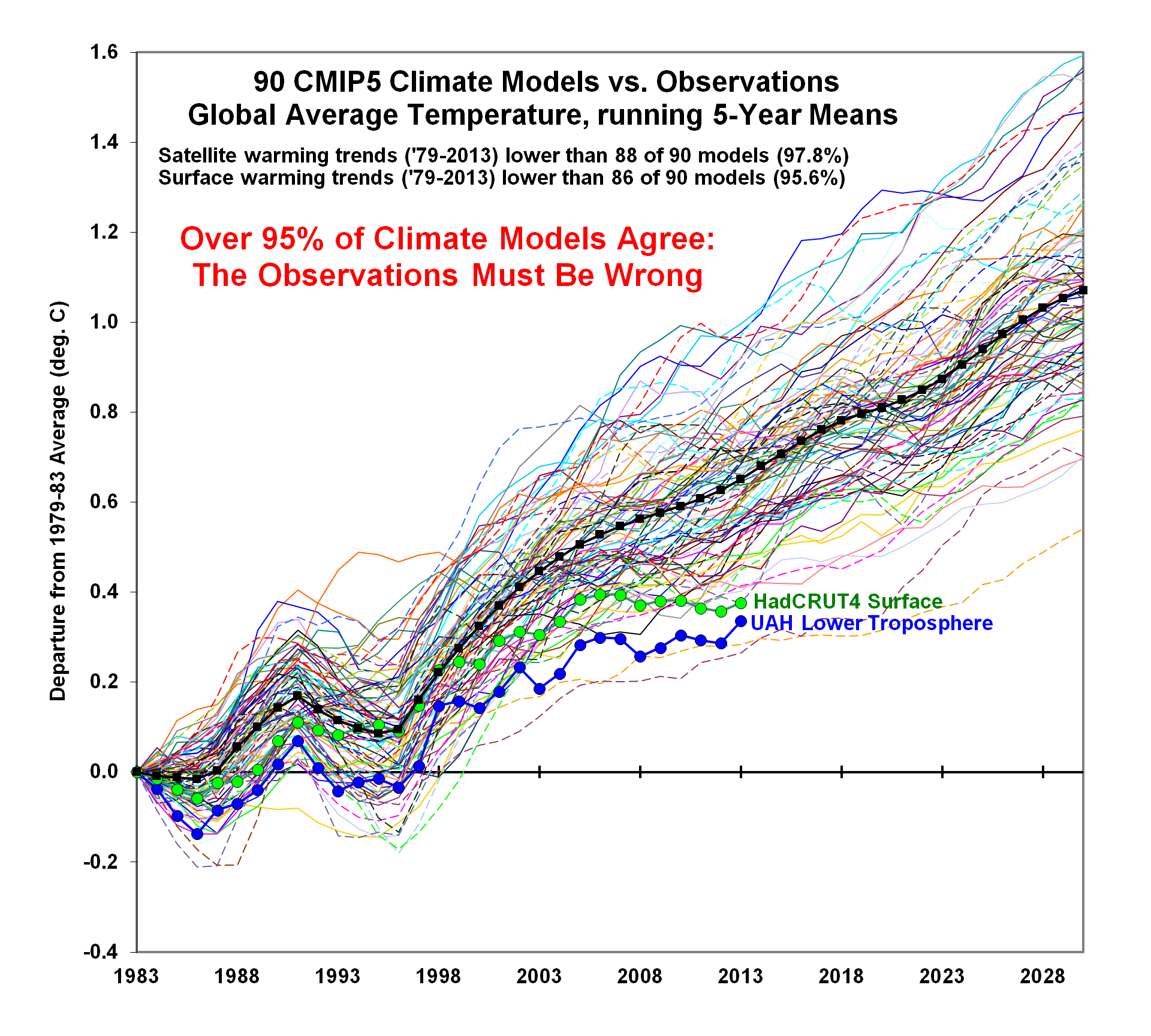
These models failed to predict the current 15- to 18-year "pause" in Global Warming, despite the increasing -even accelerating- levels of Atmospheric CO2. Furthermore, as Dr. Roy Spencer recently showed, only TWO out of 90 CMIP5 Climate Models, used in the latest IPCC Annual Report, agree with the OBSERVED SURFACE and LOWER TROPOSPHERE TEMPERATURE DATA.  Thus, over 95% of the IPCC models AGREE that, in Spencer's satirical words, "the OBSERVATIONS must be wrong" :^)

Climate Alarmists and Warmists have convinced the US, UK, and many other governments to spend tremendous amounts of taxpayer money to study the problem and to impose costly regulations to curtail human production of "greenhouse" gases.

The problem with attempts to model the Climate is that it is a combination of linear and chaotic elements, and the latter makes it virtually impossible to correctly predict the future beyond a relatively short period. See my PowerPoint Show for how I demonstrated that a chaotic model is very sensitive to initial conditions. Indeed, in my chaos model, a change in initial conditions of less than one part in a million, produced very large changes in longer-term results.

GOVERNMENT SUBSIDIES MAY BE USEFUL (IF NOT POLITICALLY ABUSED)

My talk concluded with a review of how necessary government spending, such as the vast expenditures on military aircraft during WWII and subsequent conflicts, may benefit industry and consumers, such as the commercial aircraft and airline industries. Similarly, the Space Program and Medical Research expenditures are mostly justified by the benefits they have brought to the taxpayers.

However, there is great danger when the government unnecessarily expends large sums and burdens industry and consumers with un-affordable costs for environmental purposes that are "justified" by failed Computer Climate Models.

For example:

Ethanol: The requirement that up to 15% Ethanol, derived from corn, must be blended with gasoline, despite higher costs and reduced MPG, appears to be a politically-motivated subsidy for the agricultural industry and states where corn is a major crop.

Solar Panels: US taxpayers lost $500M when solar-panel producer Solyndra went bankrupt. It appears that political influence was used in 2009 to push through a loan for them to produce solar panels in the US, despite the fact that their cylindrical technology cost several dollars per watt, as compared to flat panels available at less than a dollar per watt. They went bankrupt in 2011, only two years after the loan, and all employees lost their jobs.

There are many other examples, too numerous to mention!

Ira Glickstein

*COMPUTER MODELS BUILT BY IRA
• “Nash Bargain” Advisor Click for:  DESCRIPTION   FREE SPREADSHEET 

• Management Span of Control Advisor Click for:  DESCRIPTION   FREE SPREADSHEET 

• Visual Acuity Advisor Click for: DESCRIPTION   FREE SPREADSHEET 

• Bayesian Inference/Analysis Advisor Click for: DESCRIPTION   FREE SPREADSHEET
• Decision Aiding Model – “Trade Study” Click for:  DESCRIPTION FREE SPREADSHEET


Tuesday, June 26, 2007

LIES, DAMNED LIES, AND STATISTICS (Part 2)

All about the abuse of anecdotal math to falsify the truth and truthify falsehood.

This is the second part of my "presentation" on the topic of "Lies, ..."

Click here for the first part: http://tvpclub.blogspot.com/2007/06/lies-damned-lies-and-statistics-part-1.html


In this part, we will explore "truth and consequences" and "playing the percentages."

EXAMPLE #1: What did I say?

This year is 2007. If I told you I was born in the year 2000, how old am I?


Well, 2007 - 2000 = 7, so, I guess I am seven years old. Right?

All right, not necessarily. This is the month of June 2007, so, if a person was born before June 2000, he or she would be 7, but, if after June, he or she would only be 6. So the answer is six or seven years old. Right?

>>>>>>>>>>>>>>>>>>>

Sorry, nope! No matter what I told you, I am the age that I am. That happens to be 68 years old. I am sixty-eight years old!

LESSON: No matter what someone may say, that does not change the truth of the matter.

EXAMPLE #2: Let us move on to playing the percentages.

From now on in this posting, let us assume (for the sake of this discussion) anything in purple bold italic type font is a literal truth.

Poupon University has five academic departments. Four out of the five have more male than female professors. Thus, 80% of the departments at Poupon U. are male-dominated.

The percentages of Male/Female are as follows:

  • Engineering: 90% male / 10% female.
  • Physics: 80% male / 20% female.
  • Philosophy: 65% male / 35% female.
  • Foreign Languages: 60% male / 40% female.
  • Humanities: 25% male / 75% female.

If you average the percentages of the five departments, you get 65% male / 35% female.

That would seem absolute proof that old PU is discriminating against female professors! Right?


Not necessarily! Here are the numbers for each department, and the sum of the numbers for Poupon U. as a whole:


Note that there are EXACTLY 200 female professors and 200 male professors at old PU! The genders are EXACTLY 50/50!

What happened to the discrimination? (The same thing that happens to your fist when you shake hands!)

THE LESSON: Beware of percentages, particularly when they are averaged.


EXAMPLE #3: Percentage Increase and Percentage Decrease

In 1980, gas in the US cost about $1.50 per gallon and now it is up to about $3.00 per gallon, which is a 100% increase.

If gas prices should drop back from $3.00 to $1.50 per gallon (I'm not predicting that, just suggesting it for the purposes of illustration), that would be a 50% decrease.

What is going on? When prices go up by $1.50 we get twice the percentage increase as when they go down by the exact same amount!


If we look at the historical record, US gas prices peaked in 1980 when they were about $1.50 per gallon. Considering inflation from 1980 to 2007, that is about $3.00 per gallon in constant dollars! If you calculate the gas price as the number of minutes the average US worker must devote to earn the price of a gallon of gas, the current price is less than the historical peak in the 1980's!

The same percentage increase and percentage decrease confusion holds for unemployment, crime rates and all things that are bad.

As an example, in the Orlando Sentinel for June 26th 2007, there is a report on the increase in Florida gun crimes, based on data for 2005 and 2006. Gun Murders in Florida went from 521 in 2005 to 740 in 2006, an increase of 42.0%

What if they happen to decrease in 2007 to the same number as in 2005. That is, if they went down from 740 in 2006 to 521 in 2007? That would be a decrease of only 29.6%, 12% less of a decrease than the increase reported above.

If the number of Gun Murders in Florida happened to be 521 in odd years and 740 in even years for a decade, and you averaged the percentages, that would show an average increase of 6.2% per year while, in truth, the rate was unchanged for the decade!

THE LESSON: Beware of percentages, particularly when percentage increase and percentage decrease are compared.


Please comment on this material. (Stay tuned: I plan to post yet another part of this "presentation" in a week or so.)

Ira Glickstein

Tuesday, October 26, 2010

You Can't Believe ANYTHING !

The Atlantic, a respected mainstream literary magazine, says you can't believe anything! (November 2010 issue)

They are not talking about political adverts, but about peer-reviewed MEDICAL RESEARCH as well as Internet sites. On this Blog we've recently discussed Elite Opposition to Online Information and compared it to peer-reviewed journals and books, so these items caught my eye.

Truth Lies Here by Michael Hirschorn, is a hit piece against right-leaning web sites. It starts with the alleged efforts of the "Digg Patriots" to drive down the readership of left-leaning web items by coordinated use of the Digg "bury" option. The reader is lead to believe that left-leaning groups have not use similar tactics. Digg, a website that allows users to recommend web items has since discontinued the "bury" option so the point is moot in any case. Hirschorn goes on to misreport the Sherrod incident (which I discussed here) as well as the Acorn pimp and prostitute caper. He claims the videos were "heavily doctored" when in fact they were simply edited.

The Acorn sting video speaks for itself. According to the NY Times "...two conservative activists pretending to be a pimp and a prostitute used a hidden camera and recorded Acorn employees advising them on how to conceal the source of illegal income and manage 14-year-old Salvadoran prostitutes in the country illegally: 'Train them to keep their mouth shut.'" Perhaps the activists had to visit several Acorn sites before they got that damning video, but it is clear at least one Acorn worker had no problem helping a pimp exploit underage illegal female immigrants. In the Sherrod case the editing was misleading, but the real story was how the Agriculture Department and the NAACP "bit" and fired and condemned Sherrod, despite the fact she had informed her superiors of the true situation and the NAACP had the complete video that proved Sherrod was not a racist but was reporting on a redemptive moment in her career.

Hirschorn blasts the usual suspect, Sarah Palin, for using Twitter shorthand, including "Ground Zero mosque" (it is a cultural center and two blocks away).

Lies, Damned Lies, and Medical Science, by David Freedman, is a longer and much more serious piece that calls into question nearly all medical research. Freedman begins with the fact that Albanian immigrants to Greece have their "perfectly healthy" appendixes removed at a rate three times higher than Greeks, apparently because surgery residents are over-eager to rack up scalpel time. The researchers who uncovered the situation had trouble getting their study published, which led them to do some further investigations of medical research journals.

Many peer-reviewed medical findings are later refuted. This fact may be interpreted in two ways: 1) The system is working and correcting itself, or 2) Why are so many medical studies wrong in the first place?

Well, according to the researcher Freedman interviewed, the problem is the need for researchers to get grants and publish, and that may be accomplished only by getting new and surprising results. This leads them to come up with new theories and then construct research projects that are biased to prove those theories. Even in apparently properly set up randomized trials, results are exaggerated. For example, of 49 most widely used cited research articles over the past 13 years, 34 were retested and 41% of those were shown to be wrong or exaggerated! "Drug studies have the added corruptive force of financial conflict of interest." They hardly ever study the effect of not prescribing any medication. And, when it comes to nutritional studies, "ignore them all" is the best advice! Clearly, this information should be taken into account as we consider government involvement in health care and end-of-life issues, as I discussed here.

But medical research is not especially fact-free, "a remarkably consistent paucity of strong evidence in published economics studies made it unlikely that any of them were right."
Ira Glickstein

Friday, December 18, 2009

LIES, DAMNED LIES, AND STATISTICS (Part 6)

STATISTICS OF HEALTH CARE SPENDING
Health Care reform has been a hot topic where statistics have been used to: Abuse anecdotal math to falsify the truth and truthify falsehood.

(This is the sixth of the series on misuse of statistics. For the earlier postings, click: 1-Going to St. Ives, 2-Playing Percentages, 3-Correlation and Causation, 4-Fun with the Normal Curve, 5-Global Warming.)

In a December 2009 posting, I pointed out that the map of per capita Medicare spending by county in the US looked a lot like the political division between the "Blue Counties" (Democrats, L-Minds) and the "Red Counties" (Republicans, C-Minds).

Since counties are so numerous and therefore confusing, I used Congressional Budget Office 2004 statistics of per capita Medicare spending on a statewide basis to show that the top five Highest Spending States tended to be Blue States and the top five Lowest Spending States tended to be Red States.

(My stated purpose -agenda if you like- was to indicate that Liberals consume an outsized share of the common pot of health care resources, as compared to Conservatives who take a smaller piece of the pie per capita.)

Wednesday, October 3, 2007

LIES, DAMNED LIES, AND STATISTICS (Part 4)

All about the abuse of anecdotal math to falsify the truth and truthify falsehood.

This is the fourth part of my "presentation" on the topic of "Lies, ..." Click for Part 1, Part 2, and Part 3.

This part is about the "Normal Curve".

The height of young American women ranges from about 4' 9" to 6'. For young men it is 5' 2" to 6' 5". That's a difference of about five inches -- less than ten percent.

Therefore, in basketball and other sports where height is critical, you'd expect about ten percent fewer women than men. Right?

Anything less would be proof of discrimination against women. Right?

WRONG !!!

Actually, if you had a cut-off of six feet, over 100 men would qualify for every woman who qualified! Even if you had a cut-off of 5' 7", which is the average height of the population of young men and women combined, you'd find over five men for every woman who qualified.

WHAT IS GOING ON HERE?

Why are Our Expectations Wrong?

Glad you asked!

You have probably heard of the "Normal Curve" or the "Bell-Shaped Curve" and if you stay tuned for a bit you will understand what that is and why it is important. I promise to keep the math to a minimum and the understanding to a maximum.

The curve is called "Normal" because, when you make lots of measurements, such as the heights of a bunch of random people, you normally get a "Bell-Shaped Curve"!

Most of the measurements will be near the average value and you will get fewer and fewer as you go further away from the average.


[Click figure for larger view] The figure shows the Normal curve for the heights of young women (in red) and young men (in blue). Notice how each group of measurements resembles the shape of a bell?

Please look at the red bars that represent measurements of a thousand young women. Nearly all of them are between 57" and 72", a range of fifteen-inches. No more than five out of a thousand will be below or above that range. If you divide that range into six equal increments of two and a half inches each, about two-thirds of them will be in the two increments closest to the middle.

As indicated in the figure, in ordinary English, we would say women in that range are of "average" height.

On either side of the "average" are increments for "short" and "tall". Out of 1000, there will be about 136 "short" women and 136 "tall" women.

On either side of "short" and "tall" are "very short" and "very tall". Out of a 1000, there will only be about 21 "very short" and 21 "very tall".

The handful of women who fall outside the range would be called "extremely tall" and "extremely short".

The same situation prevails for young men, shown in blue. But note: the measurement results are shifted two increments to the right. A woman we'd call "tall" or "very tall" would be "average" if she were a man. Similarly, a man we'd call "short" or "very short" would be "average" if he were a woman.

None of the above is controversial. These are simply the facts that can be verified by anyone who would like to do the measurements.

Mathematical Terms (I'll keep this very short :^)

Mathematicians call the area that contains 68.3% of the measurements the "plus or minus one standard deviation" range. Since standard deviation is usually represented by the Greek letter “sigma”, this is called the “one-sigma” range.

A mathematician would analyze the height measurements and calculate the standard deviation as 2.5". He or she would note that the average for males is 5" above that for females and conclude that males are two standard deviations taller than females.

Please don't worry about the math terms "standard deviation" and “sigma" too much. These terms are just a fancy way of saying where to expect 68% of the measurements to be.

Representation of Women in Sports

For basketball, height is obviously a critical factor. If high schools and colleges insisted on having unisex teams, we'd find boys and young men outnumbering girls and young women by one-hundred to one! That would not be fair to girls and young women who want to play sports. That is why it makes total sense to separate basketball teams by gender.

Since height often correlates to strength and speed and other factors that are important in baseball, football, soccer and many other sports, it also makes sense to separate those sports by gender. In fact, only a small number of sports (gymnastics comes to mind) favor participants who tend to be shorter.

Bottom Line

1) In high school, college, and other amateur play, I favor separation by gender in the sports where males have a significant advantage. I would make an exception for the few girls and women who could qualify and allow them to join the male division if they wanted to.

2) For professional sports, I would make it illegal to exclude women from the highest level in any given sport. There are women who qualify, and, however few their number, it is unfair to exclude them. On the other hand, for the lower levels of professional sports, I would allow separation by gender to give highly qualified women a fair chance to play at their level.

BUT WHAT ABOUT INTELLIGENCE???

OOPS - here is where we may get "politically incorrect".

Now that you understand all about the Normal curve and standard deviation and so on, let us apply our newfound knowledge to a different domain.

Lots of well-meaning people are misinformed about standardized tests, particularly those that are said to measure "intelligence".

I'll be the first to admit that some college graduates with advanced degrees don't have the intelligence to "rub two sticks together to save their lives". Some with the highest academic honors could not survive more than a few days in the woods or on the streets of a big city.

Some PhDs are at a total loss when it comes to doing carpentry or plumbing or fixing a TV set or PC or a car. They cannot grow fruits and vegetables and would be a total failure at "animal husbandry" (whatever that is :^) Some of them have no social intelligence at all and cannot sing on key or play a musical instrument. I would not want to "have a beer" with many of them.

The standardized so-called "Intelligence Quotient" (IQ) test does not measure any of the above talents.

However, IQ tests do a damn good job of evaluating "normal" people as to their ACADEMIC INTELLIGENCE.

People with high IQs generally excel in high school and college. They also excel at jobs that require lots of reading and writing and designing and science and math and so on.

People with low IQs generally do not do well in school and they find employment in fields that do not require academic-type talents.

Design of IQ Tests

IQ tests are designed to yield a score of 100 for the average person and to have a standard deviation of fifteen points. If you give IQ tests to a thousand people (in their native languages), all but a handful will fall between 55 and 145.

Out of a thousand people, about 683 will have IQs between 85 and 115, and will be said to have "average" intelligence. About 136 will be "high" and 136 "low". About 21 will be "very high" and 21 "very low".

A handful will be out of the range. People with IQs above 145 are considered "extremely intelligent".

In some jurisdictions, those below 70, with "very low" or "extremely low" intelligence, are exempted from things like the death penalty because their intelligence is so low they cannot be considered moral agents. A considerable portion of the prison population falls in the range of 80 and below.

Here is the Politically Incorrect Part

What if there was an ethnic or racial group that had an average IQ ten percent above or below 100? Say members of group "Beta" have an average IQ of 90 and members of group "Alpha" have an average of 110? (Actually, there are groups like that, or close to that. However, political correctness forbids me from mentioning their ethnic and/or racial descriptions.)

If the IQ difference between Alpha and Beta was only twenty percent, would you expect the Alpha group to have only twenty percent higher representation among professions that require high academic intelligence? Would you expect Alpha to have only twenty percent more scientists and engineers and accountants and so on? Would you expect Alpha to have only twenty percent more PhDs?

If you did you would be WRONG.

If the standard deviation for IQ is fifteen points, and the Alpha group is twenty points above the Beta group, that is a difference of over one standard deviation.

For example, if a Nobel Prize winner had to be "very intelligent" or "extremely intelligent" in the top two increments, there would be over ten people from the Alpha group for every one from the Beta group.

If you had to have an above-average IQ (100 or more) people in the Alpha group would outnumber those in the Beta group by three to one!


Bottom Line:

If members of some ethnic and racial groups are "over-represented" and other groups "under-represented" in professions requiring higher academic intelligence, that does not necessarily imply discrimination or favoritism.

If one group has an average IQ of 110 or more, you would expect them to be "over-represented" by at least three-to-one over the average American.

If another group has an average IQ of 90, you would expect them to be "under-represented" by a factor of three-to-one or more below the average American.


BUT PLEASE NOTE:

There is a great deal of overlap.

A "tall" woman is taller than 60% of all men and an "extremely tall" woman is taller than 90% of all the men.

A "very intelligent" member of the
Beta group is smarter than 60% of all members of the Alpha group and an "extremely intelligent" member of the Beta group is smarter than 90% of all the members of the Alpha group.

Do not judge a person by his or her group membership!

Ira Glickstein


The above is the fourth part of my "presentation" on the topic of "Lies, ..." Click for Part 1, Part 2, and Part 3.

Thursday, July 5, 2007

LIES, DAMNED LIES, AND STATISTICS (Part 3)


All about the abuse of anecdotal math to falsify the truth and truthify falsehood.

This is the third part of my "presentation" on the topic of "Lies, ..." Click for Part 1, and Part 2.

In this part, we'll consider the relationship between correlation and causation.


EXAMPLE #1: Direction of Causation


You've heard the cynic claim:

The more police you see directing traffic, the bigger the traffic
jam!

The implication is: police *cause* the traffic delay. Of course, that's possible, but, more likely, the police were called to the scene because of the traffic delay. The delay was due to some other original cause.


Please consider the three situations depicted on the following chart:


ACCIDENT -- Cars stop or slow down to change lanes and snake around the accident scene. Police and ambulances and tow trucks are called to the scene. The police direct traffic around the accident while the victims are evacuated and the cars are towed away. Traffic resumes its normal pace, and the police leave.


Causation may be summarized as follows: ACCIDENT >CAUSES> Delay >CAUSES> Police.


RUSH HOUR -- Traffic predictably builds up around quitting time when many workers depart for home. Anticipating the traffic delay, police are dispatched to try to keep traffic moving as well as possible. Despite the police presence, traffic overwhems the available lanes and delays build up. Some time later rush hour ends, traffic resumes its normal pace, and the police depart.


No causative relation between the Delay and the Police. Causation is: RUSH HOUR >CAUSES> Police and RUSH HOUR >CAUSES> Delay.


ROADBLOCK -- A criminal has escaped and the Police set up a roadblock to try to catch him. Cars are stopped and searched and that causes Delays in traffic flow. At some point, the Police catch the convict and end the roadblock and traffic resumes.

Causation may be summarized as follows: ROADBLOCK by Police >CAUSES> Delay.

LESSON: Consider the time relationship between factors to determine the direction of causation.


EXAMPLE #2: CORRELATION, CAUSATION and "AN INCONVENIENT TRUTH"


OK, now we understand the time of occurance relationship between correlation and causation! Let's watch a video clip from Former VP Al Gore's infuential movie "An Inconvenient Truth." (If you have not seen the complete movie, I recommend it highly.)


In this video clip, Gore demonstrates the strong historical correlation between atmospheric carbon dioxide (CO2) and Global Warming of the surface of the Earth. He then makes some interesting claims about causation. On the basis of relatively recent and historically high CO2 levels due to human over-production of CO2, he predicts disasterous increases in Global Warming.


[DOUBLE-CLICK ON THE ARROW IN THE MIDDLE TO START THE VIDEO CLIP]


Let us consider the points made by Gore in this video clip:


  1. CO2 is highly correlated to global temperature. Historically, high surface temperature periods have been accompanied by high levels of atmospheric CO2. [TRUE]

  2. Current CO2 levels are rising above historical highs, almost certainly significantly caused by human over-production of CO2. [TRUE]

  3. Therefore, global temperatures will rise way above historical highs within the next fifty years unless humans drastically reduce production of CO2. [AIN'T NECESSARILY SO! Correlation does not necessarily imply causation!]

According to the "Real Climate" website that Stu Denenberg put me onto, which, by the way accepts and strongly supports Gore's Global Warming thesis, the historical ice core record shows that rising CO2 levels come some 800 years after global temperature rises. See full text at: http://www.realclimate.org/index.php/archives/2004/12/co2-in-ice-cores
I have copied the text verbatim and have added emphasis to some key phrases.


At least three careful ice core studies have shown that CO2 starts to rise about 800 years (600-1000 years) after Antarctic temperature during glacial terminations. These terminations are pronounced warming periods that mark the ends of the ice ages that happen every 100,000 years or so.


Does this prove that CO2 doesn't cause global warming? The answer is no.


The reason has to do with the fact that the warmings take about 5000 years to be complete. The lag is only 800 years. All that the lag shows is that CO2 did not cause the first 800 years of warming, out of the 5000 year trend. The other 4200 years of warming could in fact have been caused by CO2, as far as we can tell from this ice core data.


The 4200 years of warming make up about 5/6 of the total warming. So CO2 could have caused the last 5/6 of the warming, but could not have caused the first 1/6 of the warming.


It comes as no surprise that other factors besides CO2 affect climate. Changes in the amount of summer sunshine, due to changes in the Earth's orbit around the sun that happen every 21,000 years, have long been known to affect the comings and goings of ice ages. Atlantic ocean circulation slowdowns are thought to warm Antarctica, also.


From studying all the available data (not just ice cores), the probable sequence of events at a termination goes something like this. Some (currently unknown) process causes Antarctica and the surrounding ocean to warm. This process also causes CO2 to start rising, about 800 years later. Then CO2 further warms the whole planet, because of its heat-trapping properties. This leads to even further CO2 release.


So CO2 during ice ages should be thought of as a "feedback", much like the feedback that results from putting a microphone too near to a loudspeaker.


In other words, CO2 does not initiate the warmings, but acts as an amplifier once they are underway. From model estimates, CO2 (along with other greenhouse gases CH4 and N2O) causes about half of the full glacial-to-interglacial warming.


So, in summary, the lag of CO2 behind temperature doesn't tell us much about global warming. [But it may give us a very interesting clue about why CO2 rises at the ends of ice ages. The 800-year lag is about the amount of time required to flush out the deep ocean through natural ocean currents. So CO2 might be stored in the deep ocean during ice ages, and then get released when the climate warms.]


I accept the factual statements above as true, but some of the reasoning seems a bit tortured to me. Levels of CO2 begin their increase about 800 years after Warming has begun its increase. The ice core data also shows that temperatures decrease a thousand years or more before CO2 begins to decrease. That implies the direction of causation is: SOMETHING ELSE >CAUSES> Warming >CAUSES> CO2 increase and Reduction of SOMETHING ELSE >CAUSES> Cooling >CAUSES> CO2 reduction.


Like the situation described above, where ACCIDENT >Causes> traffic Delay >CAUSES> Police to be dispatched, it appears clear that SOMETHING ELSE causes the Warming and then the Warming causes CO2 levels to rise. That makes sense. If you take an ice cold glass of soda and leave it at room temperature for an hour, the CO2 bubbles out as the soda warms. Similarly, but on a global scale, CO2 is disolved in the oceans and, as the Earth surface warms, more of the CO2 comes out into the atmosphere. When that SOMETHING ELSE gets reduced, Cooling causes CO2 levels to drop as more of the CO2 gas is re-absorbed into the oceans.


What might that SOMETHING ELSE be that causes Warming when present and Cooling when it goes away? It's the SOLAR RADIATION FROM THE SUN stupid!


Reread the fifth paragraph of the above quote. They say the Earth's orbit around the Sun varies on a cycle of 21,000 years and that is known to affect the comings and goings of ice ages. Right on!

But it is more complicated. According to http://www.homepage.montana.edu/~geol445/hyperglac/time1/milankov.htm there are three major cyclic components that affect the Earth's orbit around the Sun: (1) Eccentricity of ~100,000 years, (2) Axial Tilt of ~41,000 years, and (3) Precession (or "wobble") of ~23,000 years. These components do not affect the total amount of solar radiation reaching the Earth, but rather energy distribution between the polar and equatorial areas and seasonality. That, in turn, affects the build up and melting of polar ice. Based on the ice core data, the combination of these cycles triggers cooling and warming periods.

Energy radiation from the Sun varies on several cycles, the best known of which is called the "Sun spot cycle" and happens every eleven years. There are longer cycles of variability that extend to centuries and millenia.

Therefore, when the orbital and solar radiation cycles happen to coincide, which may occur around every 100,000 years, a Global Warming cycle is initiated. The Warming causes more CO2 to be driven out of the oceans and, over an 800 year period, CO2 levels rise and stay high until the solar radiation high point passes. At that point, Cooling begins and, a thousand years or more later, CO2 levels decrease as the more of the CO2 gas is again absorbed into the cooler oceans.


Reread paragraph eight of the above quote. They clearly say that "CO2 does not initiate the warmings, but acts as an amplifier once they are underway."


They are partially correct. Yes, like the ROADBLOCK situation, where Police >CAUSE> Delay, it is also possible for CO2 to cause (more) Warming when it gets into the atmosphere and acts as a greenhouse gas. However, since the ice core data show sustained high levels of CO2 for a thousand or more years after Cooling starts, it is clear the CO2 levels do not cause the Cooling either.


Therefore, the ice core data show the relationship between global temperatures and CO2 levels are more like the ACCIDENT scenario than the ROADBLOCK scenario. In their third paragraph, the "Real Climate" writers make much of the fact the 800 year delay is only a sixth of the 5000-year cycle. So, they say, during the other 4200 years CO2 could be the cause of the Warming. Well, if you look at the ACCIDENT scenario, the lag between the traffic Delay and the arrival of the Police is also much shorter than the total time it takes for the ambulances and tow trucks to evacuate the victims and clear the wrecks, but that still does not mean the Police are the cause of the Delay!


CONCLUSIONS


1) GLOBAL WARMING IS A REAL PROBLEM -- Am I claiming that Global Warming is not a problem? No, that is not my claim at all. I believe we are in a definite Global Warming cycle.


2) GLOBAL WARMING IS PARTLY DUE TO HUMAN-PRODUCED CO2 -- A significant amount of atmospheric CO2 and therefore greenhouse warming is caused by the historically unprecedented production of CO2 due to human civilization. That part of the equation is under human control and we may be able to do something about it with concerted action (but don't hold your breath waiting for that action, see item (6) below).


3) BUT, THE MAIN CAUSE IS THE SUN, STUPID! -- I believe the main cause of the current Global Warming cycle, as of all previous cycles according to the ice core data, is increased solar radiation and the distribution of the solar energy falling on the Earth, due to a combination of orbital cycles and Sun spot and other solar cycles. That part of the equation is out of our control.


4) GORE'S MOVIE HAS SOME MAJOR PROBLEMS -- My problem with the Gore movie is his implication that the ice core data, per se, is applicable to our current situation. As careful reading of the pro-Gore (but still honest :^) "Real Climate" website postings reveal, that is not true. Our current situation is totally unprecedented because human civilization, until the past few hundred years, has not been capable of producing enough greenhouse gas to be significant on the scale of solar radiation.


5) "POLITICAL CORRECTNESS" HAS AFFECTED SCIENTISTS -- The above "Real Climate" website quote was composed and posted a few years ago, before Gore's movie came out. That website has a more recent posting regarding the lag of CO2 behind temperature. While, to their credit, they still link to their older posting quoted above, and they are a bit critical of some of Gore's statements, the new posting shows signs of "political correctness" when it comes to Global Warming.


You can read their new posting by clicking here: http://www.realclimate.org/index.php/archives/2007/04/the-lag-between-temp-and-co2/

The headline says: "The lag between temperature and CO2. (Gore’s got it right.)" That is an indication they are on Gore's side.


However, to their credit, they also say the following about what Gore did and did not do in the video clip you just watched:


What Gore should have done is extrapolated the temperature curve according this the appropriate scaling -- with CO2 accounting for about 1/3 of the total change -- instead of letting the audience do it by eye. Had he done so, he would have drawn a line that went up only 1/3 of the distance implied by the simple correlation with CO2 shown by the ice core record.

The quoted paragraph is a complicated way of saying, correctly in my opinion, that Gore led his unsophisticated audience to believe Global Warming due to human-produced CO2 was about three times worse than the available scientific estimates justify.


6) WHAT PRACTICAL THINGS CAN WE DO ABOUT GLOBAL WARMING? -- Not a heck of a lot! The portion of Global Warming due to Human overproduction of CO2 is almost certainly below 50% and more likely less than 20%. Thus, even if we could cut global CO2 production in half, we might reduce the temperature increase by 25% at best. More likely, a 50% cut in global CO2 production would yield less than a 10% reduction in Global Warming. So, if the projected increase in average global temperature over the 50 to 100 years is 2.0 degrees, we could cut it down to "only" 1.5 to 1.8 degrees.


Theoretically we could cut CO2 production in half, but I strongly doubt we will. My wife and I share one car, a hybrid gas-electric Prius. We get actual 45-55 MPG, which is about double the gas mileage for the average car, implying a 50% cut in emissions. To achieve 55 MPG, I have to drive extraordinarily carefully, with slow accellerations and extreme anticipation of traffic light changes to avoid most braking. My antics are probably driving other motorists crazy. Also, much of our gasoline savings were cancelled out by the initial higher cost of the Prius compared to similar standard cars as well as the costs we face when the batteries wear out or the fancy gas-saving electronics fail. My wife and I use our electric golf cart for much of our local travel and I also use my bicycle for 40-50 miles per week. We have the luxury of doing all this because we are retired. How many Americans and others living in industrialized countries will follow our example? Not many!


Even as gasoline prices hit $3 and even $4 in some places, we Americans increased our usage! That is an indication "we have money to burn" and gasoline prices are too low rather than too high. I favor a punitive "carbon" tax on non-renewable energy. It would start at $1 per gallon of gasoline (or the equivalent in coal energy, etc.) and go up $1 per year until usage levels began to decline. I think it will take a $10/gallon increase, so that will give Americans ten years to adjust their usage patterns. John Kerry proposed such a tax a decade ago but had to abandon it because it has no political traction whatsoever. What are the chances the "carbon" tax will get passed in our lifetime? You are correct, the changes are about ten degrees below absolute zero. Tis a pity!


China and India and other formerly less-developed countries have modernized their economic systems and will soon be consuming energy at levels rivaling our own. They will not stop their industrialization.


7) EVEN THE "GOOD NEWS" IS BAD! -- Is there any way we might see a reduction of 50% in human-generated CO2? Well, globalization might help put social pressures on excessive human breeding. Reproduction is below replacement rates in some industrialized countries. Population growth in those countries is mainly due to immigration. As the social effects of globalization spread to more and more countries, worldwide reproduction may fall to below replacement levels. Over time, we might reach a 50% reduction in population. But, would that translate into 50% less CO2 or would the people just ramp up their use of energy? What do you think?


A major genetic engineering disaster that killed a billion people would result in a rapid population drop. Or, even worse, a localized nuclear war would not only rapidly reduce population, but also cause a mini "nuclear winter" as high-altitude debris from the nuclear explosions reduced the transparency of the atmosphere to incoming solar radiation. I don't think any of us would wish for these types of disasters.


Those of us who look favorably on the "Gaia Hypothesis" that the Earth has some sort of Global Consciousness might be comforted by the thought that Global Warming is "Gaia's plan" to warm the Earth in preparation for the coming chill of "nuclear winter." As nuclear weapons spread to more and more countries and terrorist groups, nuclear war seems all-but-inevitable. Ah, how I wish I could muster a higher level of religious belief!


LESSON: Situations change and statistics that correctly described the past may not apply to the present.


Ira Glickstein


The above is the third part of my "presentation" on the topic of "Lies, ..." Click for Part 1, Part 2, and Part 4.