Showing posts with label climate science. Show all posts

Sunday, February 11, 2018

Big Global Warming Debate at The Villages (FL) Science Tech Club


The title of the debate was "Two Views on Human-Caused Global Warming". Fellow Villager Don Fogg took the AFFIRMATIVE and I (Ira Glickstein) took the NEGATIVE in a friendly but spirited debate with considerable participation by the overflow audience. Our mutual friend, Steve Hendrickson, was kind enough to video the entire event. The photos  in this Blog posting are frame grabs from his excellent video.

Our combined PowerPoint chart set is available from The Villages Science Technology Club at: https://drive.google.com/file/d/1YPiXPuaHLcXeP3p2D_d5AfNekEXMIwVg/view  

We agreed on five QUITE SPECIFIC debate ISSUES, as listed at the bottom of the following photo:


For the most part, this was a science-based debate because Don and I agree on most of the basic science. Our level of agreement was stated in the following stipulations:

Both parties agree, for purposes of this debate, that:
1.The Atmospheric “Greenhouse” Effect is true science. Atmospheric gases, mostly Water Vapor and CO2, are responsible for the Earth surface being about 33⁰C warmer due to this effect. All else being equal, a rise in CO2 will cause mean temperatures to rise. 
2.CO2 levels in the Atmosphere have been rising at an unprecedented rate over the past century, from less than 300ppmv to over 400ppmv. At least half of that rise is due to human activities, primarily burning of fossil fuels.
3.The Intergovernmental Panel on Climate Change (IPCC) has issued five “Assessment Reports” from 1990 to 2013, with projections for future warming based on over 100 Climate Models.
4.NASA-Goddard Institute for Space Studies (GISS) is the main US-government funded Climate agency, tracking, reporting, and adjusting historical US and world-wide terrestrial thermometer data (1880-present), and contributing to the IPCC.

5.The US government also funds satellite systems that measure lower atmospheric temperatures, available since 1979. University of Alabama at Huntsville (UAH) and Remote Sensing Systems (RSS) are the major US-government funded groups for satellite-based world-wide temperature tracking.

IRA'S MAIN DEBATE POINTS

1) While the Earth Surface has definitely warmed since 1880, and some portion of  that warming is due to human activities (mainly burning unprecedented quantities of fossil fuels and land use changes) the AMOUNT of warming has been inflated by around 0.5⁰C and the DEGREE of human-causation has been exaggerated.

2) The Official Climate Models, based on the IPCC and NASA-GISS Climate Theory, run HOT. They thus give an over-stated sense of danger and therefore urgency, which is not supported by the rather modest warming.

3) As Richard Feynman famously said
"It doesn’t matter how beautiful your theory is, it doesn’t matter how smart you are. If it doesn’t agree with experiment, it’s wrong."

The Official Climate Theory is wrong in that Climate Models based on that Theory run HOT compared to the observational data. Thus, the climate "experiment" results do not agree with the  theory. The Official Climate Team should correct their theory. Instead, they  have inflated their observational data!

I believe the major problem with the Climate Models is how they treat CLOUDS. Daytime clouds have a net NEGATIVE impact on warming, while nighttime clouds have a POSITIVE impact. The Climate Models assume, incorrectly IMHO, that the overall net effect of increasing clouds (daytime and nighttime) is POSITIVE, while, based on actual data, it is NEGATIVE. In addition, the Climate Models do not properly account for thunderstorms, which remove heat from the surface and move it into the Atmosphere where it can more easily be radiated out to space.

There are over 100 Official IPCC Climate Models that date from the early 1990's. These Climate Models have been updated with each Assessment Report issued. Taking their 2007 report, called "AR4", the average of all their Climate Model PREDICTIONS (which they call "projections") have tended to be WARMER, by a factor of two or three than the best worldwide temperature measurements.

[Added 13 Feb 2018] For example, when the AR4 Predictions are aligned with the Berkeley Earth Surface Air Temperature (as in the photo below), the predictions for the years following 2007 go up sharply by about 0.2⁰C, but actual measurements show an increase of less than 0.1⁰C.


As Yogi Berra famously said: "It's tough to make predictions, especially about the FUTURE."

Climate Model predictions about the PAST are called "retro-dictions" and one would expect any good Climate Model would retro-dict the PAST quite well, because the scientists constructing the models have actual data from the PAST in hand. Never-the-less, as  the photo shows, the average retro-dictions run hot by about 0.2⁰C for the period 1880 through 1940. [End of added material]


ADJUSTMENTS TO US TEMPERATURE DATA

As the following slide indicates, US terrestrial temperature data, based on thousands of observations of surface-based thermometers by dedicated Americans since 1880, has been adjusted by American scientists at NASA-GISS at least seven times between 1999 and the present.

The slide focuses on two specific very warm years, 1998 and 1934. However, the adjustments affected virtually all temperature data from the 1920's through the 1990's. US Temperatures for the years prior to the 1970's were cooled, and for the years following the 1970's were warmed.

As NASA-GISS reported in 1999, the US, in 1934, was over half a degree C (0.541⁰C) WARMER than 1998. This was, shall we say "inconvenient" since their objective was to alert the American public to what they thought was a future of catastrophic human-caused warming.

The data points on the chart are based on a surprisingly candid 14 Aug 2007 email from NASA-GISS Research Scientist Makiko Sato, PhD, to her boss James Hansen, PhD. (The email was released in 2010 due to a Freedom of Information Act (FOIA) action by Judicial Watch.) 

Sato's FOIA email details the results of seven adjustments (YOUR TAX DOLLARS AT WORK :^(.

Sato started in 2000 and 2001, where by two mighty analysis efforts she got 1934 to COOL by about a quarter degree C, and 1998 to WARM by a similar amount. However, even after  this effort, 1934 was still a bit WARMER than 1998.

The data sat undisturbed in her desk for four years, until 2005, when a third analysis kept 1934 about as COOL as it had been according to her year 2001 effort. However (HORRORS!!!) 1998 COOLED back down about a quarter degree C, back to the original values reported in 1999. So according to her 2005 analysis, the US in 1934 had been about a quarter degree C WARMER than 1998.

Sato's boss, James Hansen, was a key technical advisor to Al Gore for his "Inconvenient Truth" lecture tour and movie, scheduled for release in 2007. So, if  the Earth was supposed to be in a HUMAN-CAUSED CATASTROPHIC WARMING trend, it was "inconvenient" for the warmest US year in the last half of the 20th century to be COOLER than the warmest year in the first half. 

So, Sato did three more analyses in January 2007 (the fourth since 1998), March (2007 the fifth since 1998), and August 2007 (the sixth since 1998). She got 1934 and 1998 very close to the same temperatures. Indeed, although the January and August analyses had 1998 a bit COOLER, the March analysis, after heroic effort by Sato, got 1998 a teeny-tiny bit WARMER than 1934.

However, despite this triple re-analysis attack Sato's FOIA email ends with 1934 still a bit WARMER than 1934, but only by a teeny-tiny 0.003⁰C.

Never-the-less, in the years following Sato's 2007 email, NASA-GISS continued to plough your taxpayer dollars into re-analysis of the 1934 and 1998 data. I looked up the latest US data on their website, and 1998 is finally over a tenth degree C (0.114⁰C) WARMER than poor old 1934.

ON THE NASA-GISS WEBSITE THEY ADMIT "These adjustments caused an increase of about 0.5⁰C in the US mean for the period 1900 to 1990." See:   https://data.giss.nasa.gov/gistemp/faq/#q215
(NOTE: By my accounting, the actual increase is over 0.6⁰C, but "close enough for government work"!)

NASA-GISS also notes the adjusted data is only "1.6% of the Earth's surface". The implication being these adjustments have minimal impact on world-wide data.  See: https://data.giss.nasa.gov/gistemp/graphs_v3/

HOWEVER, IF AMERICAN SCIENTISTS CANNOT ANALYZE AMERICAN DATA TO WITHIN HALF A DEGREE C, WHY WOULD ANYONE BELIEVE WORLD-WIDE DATA (SOME OF IT FROM THIRD-WORLD COUNTRIES) AND ASSOCIATED ANALYSIS IS ANY BETTER?

I spot a definite WARMING TREND, do you? If we look at this data in future years, I fully expect 1998 to take its "rightful" place at least 0.5⁰C WARMER than bad old 1934. OUR TAX DOLLARS AT WORK.


The Official rationale for the repeated adjustments (at least seven by my count) is that, over the many years since 1880, US thermometer readers tended to read their thermometers at different times of day.We all know that early morning and late evening tends to be cooler than midday (sometimes by 10⁰C !) Also, when the thermometer sites are relocated, say from the local newspaper office to a new airport, the new site may be a bit warmer or cooler. So, those changes, quite obviously, have to be taken into account to make sure errors are not introduced.

Are we to believe that James Hansen (head of NASA-GISS starting in 1981) and his respected research scientists did not know about these Time of Observation and Site Relocation effects until 2000? Hansen had worked on Climate Science for over 19 years before he and his staff realized adjustments were necessary?

Does anyone believe that, when they finally figured out they had to make these adjustments, it  took them seven analyses, over a decade or more, to get the "RIGHT" answer?

I tend to believe that many government-funded research projects are done less than competently. However, I simply do not believe Hansen and Sato were that incompetent.

No, I think they saw it as their "duty" to warn us about an impending climate catastrophe (and thus keep taxpayer money coming in), so they beat the old US data mercilessly, until they got the "RIGHT" results. (The 1934 data was old enough to qualify for Social Security :^).

If these were the inflation-adjusted profit reports of a corporation trying to spin a tale of continually-increasing profits, and the data published in 1999 showed 1998 was $ 0.5 Billion LESS profitable than 1934, and seven subsequent published reports showed variously changing reports ending with a virtual tie, would anyone believe it? Any competent observer would suspect "the books have been cooked!"

SUMMARY


TRUTH-IN-ADVERTISING: ALL GOVERNMENT-FUNDED RESEARCH WILL INEVITABLY YIELD RESULTS DESIGNED TO YIELD FURTHER FUNDING.


I'd love to see comments posted to this Topic (especially by Don). In accordance with my duties as Moderator of my Blog, I promise to approve any substantive response, positive or negative. Also, if Don or any of his allies wish to post an entire Topic commenting on or refuting my claims, I will happily grant them the status of Authorized Author on this Blog.


Ira Glickstein
Saturday, August 12, 2017

How Climate Science Has Gone Astray

Here is a great August 2017 YouTube video interview of Judith Curry, PhD. She explains how Climate Science got mixed up with Politics and went astray - AND - how she was "thrown out of the tribe" for expressing her expert, but contrary, views. I generally agree with Curry.

For more information, see the World's Most Viewed Global Warming and Climate Website.
https://wattsupwiththat.com/2017/08/11/dr-judith-curry-explains-the-reality-of-bad-climate-science-and-bad-politics/

I happen to be a Guest Contributor at that website: https://wattsupwiththat.com/author/iraglickstein/

Ira Glickstein

Sunday, November 20, 2016

Watts Up With That? - Ten Years of the World's Most Viewed Climate Site


Congratulations to Anthony Watts for creating and running the World's Most Viewed Climate website! At this TEN YEAR point, WUWT has achieved over 291 Million page views, and nearly 2 Million comments.

I've been a Guest Contributor to WUWT for six years and my 36 postings have garnered over 360 Thousand page views, and over 8 Thousand comments. I'm very proud to be included in the following list of distinguished people Anthony has thanked personally:


You may view my WUWT postings here.

Please have a look at my VISUAL IRA Blog for "Visualizing Science and Technology with Ira" in the following areas:
Ira Glickstein

Thursday, May 28, 2015

VISUALIZING: for Science and Technology

Computer Model Visualization of Crash-Dummy

Nowadays it is common to use computer models, such as the crash-dummy in the adjacent image, to help us VISUALIZE and better understand complex situations and systems. Prior to the advent of computer models, we had to use mental models in our "mind's eye", along with physical aids such as paper maps and diagrams, modelling clay, and other means.

LINKS TO RELATED POSTINGS AND RESOURCES
VISUALIZING Relativity - PowerPoint Show
VISUALIZING Relativity - Excel Spreadsheet
VISUALIZING for Science and Technology - Blog Posting
VISUALIZING Einstein's "Miracle Year" - Blog Posting
VISUALIZING My Insight Into Lorentz Gamma - Blog Posting
VISUALIZING the "Twin Paradox" - Blog Posting

Albert Einstein was a great physicist, with all the requisite mathematical tools. However, he rejected purely mathematical abstraction and resorted to physical analogy for his most basic insights. For example, as part of the thought process that resulted in his theories of Special Relativity (1905) and General Relativity (1915) he imagined himself riding along a beam of light; or as an observer standing along the tracks as a train zipped by at near-light-speed; or as a scientist sealed in a closed box and not able to tell if the box was stationary on the surface of the Earth, subject to gravity, or in deep space, far from massive objects, but subject to acceleration due to being dragged by a rocket at ever-increasing speeds.
VISUALIZING the Solution
Using Math and Graphics

Of course, Einstein and virtually all scientists and technologists use mathematical abstractions to quantify the meaning in our visualization models. We change the initial conditions and run these models to simulate what may or may not happen in different situations.

COMPUTER MODELS FOR VISUALIZATION

As personal computers and the Internet have become endemic, manual typewriters, paper maps, physical books, and so much else has been displaced by automated versions. Similarly, computer visualizations and models have displaced older methods - except for that old reliable "mind's eye" which remains as important as ever.

During my career as a Senior System Engineer at IBM and Lockheed-Martin I made extensive use of computer models and visualizations and have continued to do so since retirement.

In particular, I have created visualizations for the Atmospheric "Greenhouse" Effect and Einstein's Special and General Relativity. 

VISUALIZING THE ATMOSPHERIC "GREENHOUSE" EFFECT

As a Guest Contributor to the World's most popular Climate site, I authored a four-part series on Visualizing the Atmospheric "Greenhouse" Effect that attracted over 65,000 page views and over 2000 comments (see:  Physical Analogy,  Atmospheric Windows Emission Spectra, and Molecules and Photons,) The following graphics are some of the animated visualizations I created for that series.   


Physical Analogy

Model of a Physical Greenhouse
Model of the Atmospheric "Greenhouse"Effect

Modeled Down to Photons and Air Molecules


VISUALIZING EINSTEIN'S SPECIAL AND GENERAL RELATIVITY


Perhaps the most well-known equation in the world is E = mc2, recognized by virtually every person. But, what does it really mean?

And, many people know about the so-called "twin paradox", where one twin goes off on long mission at high speeds into space, and comes back younger. But why does this happen and exactly what causes it?

If "everything is relative" why isn't the stay-at-home twin also also younger? So, everything is not relative, and perhaps Einstein's original name for his theories "Invariance" is more apt -for the fact all observers, including those moving at different speeds, measure the same speed for light.

If the traveling twin is younger due to experiencing high speed and acceleration, then it is aging that has slowed down, not time, per se.

Furthermore, what, precisely, is TIME? And how is TIME united with SPACE to form SpaceTime?

When you Google any of this stuff you are quickly buried in equations and tensor mathematics that no one (even an engineer like me) can really understand!

Well, all this bothered me for most of my life until, back in 2012, I decided to answer Alan Alda's Flame Challenge "What is Time?" and produce a short video. In the research process for that project, I think I had a critical insight into TIME, SPACE, and RELATIVITY that may help you VISUALIZE this important scientific theory.

Time - the fourth dimension (2013 Flame Challenge) from Ira V Glickstein on Vimeo.

Since that time, I've continued to delve into Relativity and I've come up with what I think is a unique way to visualize and ... perhaps ... even understand it. The following images are screenshots from an Excel spreadsheet I created to provide myself (and you :^) a "hands-on" experience with the relativistic effects of high speed (kinetic energy) and high acceleration (potential energy), including time dilation, length contraction, and the curvature of SPACE and TIME. It is available free.


Free Excel Spreadsheet for VISUALIZATION of Einstein's Special and General Relativity. 

Image is of the Main Panel where user selects a Star, Planet, or Set Angle Option. In the case illustrated, the SpaceTime angle is set to 30º, where velocity is half the speed of light. This causes clocks to slow down by 13.4%, which corresponds to 49 days per year or 482 seconds per hour. Right side shows Special Relativity Effects due to the Kinetic Energy of moving at half the speed of light in empty Space. Left side shows equivalent General Relativity Effects, where Time "curves" due to the Potential Energy of being "at rest" close to a Black Hole.


Free Excel Spreadsheet for VISUALIZATION of Einstein's Special and General Relativity. 

Image is of the SpaceTime view of the right side of the Main Panel (where the vector sum of TRAVEL + AGING = 1) plus the Minkowski-Like SpaceTime view (where the simple sum of TRAVEL + AGING =1).  

Free Excel Spreadsheet for VISUALIZATION of Einstein's Special and General Relativity. 
Image is of the Minkowski-Like view (described above) compared to a Planck view, where both Space and Time are assumed to be discrete, and Each tiny cell is 1 Planck Time (tby 1 Planck Length (â„“P).

THE MAP IS NOT THE TERRITORY!

As my principal PhD advisor, Howard Pattee, taught me, "The MAP is NOT the TERRITORY". That sage statement means that no model is exactly the same as the thing being modeled (else it would be the real thing.)

We make models because the real thing is too complex and difficult for us to visualize, or -like the Global Climate- is not readily available for us to experiment upon.


The MAP is NOT the TERRITORY !
Many a General (or football coach) has moved symbols around on a map of the field of battle, convincing himself and his staff of inevitable victory, only to find his opponent also had a model, perhaps a better one plus superior forces to carry it to victory. 

We generally model only the most important or critical parts of the situation or complex system we are trying to visualize. We consider the model to have been successful if the results match actuality to some level of fidelity, at least for those significant portions. If subsequent testing reveals that the model does not comport with reality, we must improve or discard it.

CONCLUSION

This is the first of what I believe will turn into a series detailing my VISUALIZATION of Einstein's Relativity. Please stay tuned!

Ira Glickstein

Sunday, March 8, 2015

Blog MILESTONE - Over a Quarter Million Page Views!


The Virtual Philosophy Club, my main Blog, has just passed the 200,000 page view mark! Including my three other Blogs (Curb Your Enthusiasm (2,034 views), Life, Liberty, and Technology (10,402 views),  and The Hawking Plan (my free online novel) 42,289 views) the total sum stands at nearly 255,000 page views.

Add to that my postings as a Guest Contributor to Watts Up With That, the world's most viewed Climate Blog,  that earned 290,629 page views, and my online writings have garnered over a half-million page views. (In addition, an unknown number of my Watts Up With That postings have been republished on other Blogs, most likely adding at least 100,000 additional page views.

The point of this is that I, an ordinary person, with a PC and web access, have reached hundreds of thousands of people with my views as a "Citizen Journalist", see: Guardians at the Gate are GONE - Freedom of the Press !!!,  and The Blogosphere - Millions of Citizen Journalists.


I've also posted videos on Vimeo and You Tube that have garnered thousands of views.

Other than the cost of Internet access, and electricity for my PC, all this activity has not cost me a single dime. (On the other hand, it has not earned me a penny either).

Ira Glickstein

Monday, November 10, 2014

Lies, Computer Models, and Government Subsidies


Updating Mark Twain's famous opinion that "Lies, Damned Lies, and Statistics" were three types of untruths, with "statistics" being the worst, I presented "Lies, Damned Lies, Computer Models, and Government Subsidies" to an astute audience at the Science-Technology Club at The Villages, FL, today. You may download the Powerpoint Show HERE.

COMPUTER MODELS ARE VERY USEFUL (BUT MAY BE MISUSED)

I generally love Computer Models, having produced several useful ones myself *. However, when it comes to the misuse of Climate Models to justify spending hard-earned taxpayer money for unworthy projects, my love has its limits.

I showed the attentive and interactive audience how I was able to model the latest NASA-GISS Global Land-Ocean Temperature Index using two sinusoids and one exponential. (See the graphic, above. The bright red line is the 5-Year Running Mean of the Temperature Anomaly in °C from 1880 through 2014. The blue and red sinusoids, representing natural cycles, have periods of 33- and 70-years, respectively, and the green exponential represents the increasing levels of "greenhouse" gases. Note how the thick black line, which is the sum of the sinusoids and the exponential, fairly closely matches the NASA-GISS Temperature Anomaly.)

Of course, the easy part of computer modeling is retro-dicting the past. As John von Neumann famously told Enrico Fermi, “With four parameters I can fit an ELEPHANT, and with five I can make him wiggle his trunk.”

The hard part is predicting the future, and I make no claims regarding my simplistic model's ability to do that. However, the IPCC (Intergovernmental Panel on Climate Change) and the rest of the Official Cliimate "Team" do take their models seriously. In the latest IPCC Assessment Report, they continue to predict a catastrophic future based on their failed models.

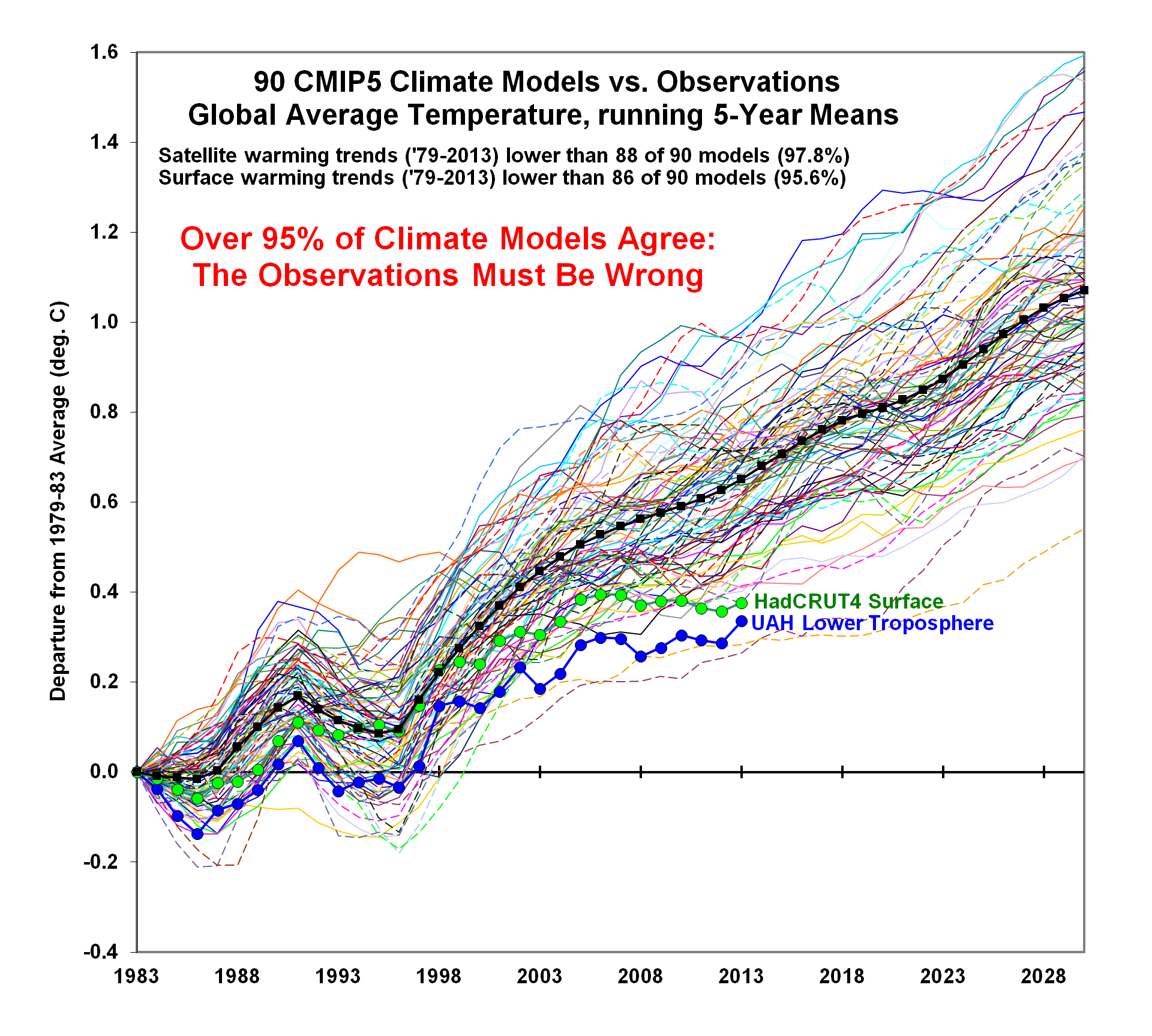
These models failed to predict the current 15- to 18-year "pause" in Global Warming, despite the increasing -even accelerating- levels of Atmospheric CO2. Furthermore, as Dr. Roy Spencer recently showed, only TWO out of 90 CMIP5 Climate Models, used in the latest IPCC Annual Report, agree with the OBSERVED SURFACE and LOWER TROPOSPHERE TEMPERATURE DATA.  Thus, over 95% of the IPCC models AGREE that, in Spencer's satirical words, "the OBSERVATIONS must be wrong" :^)

Climate Alarmists and Warmists have convinced the US, UK, and many other governments to spend tremendous amounts of taxpayer money to study the problem and to impose costly regulations to curtail human production of "greenhouse" gases.

The problem with attempts to model the Climate is that it is a combination of linear and chaotic elements, and the latter makes it virtually impossible to correctly predict the future beyond a relatively short period. See my PowerPoint Show for how I demonstrated that a chaotic model is very sensitive to initial conditions. Indeed, in my chaos model, a change in initial conditions of less than one part in a million, produced very large changes in longer-term results.

GOVERNMENT SUBSIDIES MAY BE USEFUL (IF NOT POLITICALLY ABUSED)

My talk concluded with a review of how necessary government spending, such as the vast expenditures on military aircraft during WWII and subsequent conflicts, may benefit industry and consumers, such as the commercial aircraft and airline industries. Similarly, the Space Program and Medical Research expenditures are mostly justified by the benefits they have brought to the taxpayers.

However, there is great danger when the government unnecessarily expends large sums and burdens industry and consumers with un-affordable costs for environmental purposes that are "justified" by failed Computer Climate Models.

For example:

Ethanol: The requirement that up to 15% Ethanol, derived from corn, must be blended with gasoline, despite higher costs and reduced MPG, appears to be a politically-motivated subsidy for the agricultural industry and states where corn is a major crop.

Solar Panels: US taxpayers lost $500M when solar-panel producer Solyndra went bankrupt. It appears that political influence was used in 2009 to push through a loan for them to produce solar panels in the US, despite the fact that their cylindrical technology cost several dollars per watt, as compared to flat panels available at less than a dollar per watt. They went bankrupt in 2011, only two years after the loan, and all employees lost their jobs.

There are many other examples, too numerous to mention!

Ira Glickstein

*COMPUTER MODELS BUILT BY IRA
• “Nash Bargain” Advisor Click for:  DESCRIPTION   FREE SPREADSHEET 

• Management Span of Control Advisor Click for:  DESCRIPTION   FREE SPREADSHEET 

• Visual Acuity Advisor Click for: DESCRIPTION   FREE SPREADSHEET 

• Bayesian Inference/Analysis Advisor Click for: DESCRIPTION   FREE SPREADSHEET
• Decision Aiding Model – “Trade Study” Click for:  DESCRIPTION FREE SPREADSHEET


Saturday, September 6, 2014

A Global Warming Skeptic Guide for the Perplexed

How should responsible Global Warming Skeptics respond to opinions from intelligent members of the general public who have been perplexed by the Warmists and Alarmists?

NOTE: AN UPDATED VERSION OF THIS HAS BEEN PUBLISHED AT THE WORLD'S MOST POPULAR CLIMATE WEBSITE, SEE

http://wattsupwiththat.com/2014/09/10/a-guide-for-those-perplexed-about-global-warming/ 

PLEASE CLICK THE LINK TO SEE IT. PLEASE FEEL FREE TO JOIN THE CONVERSATION.

IN THE FIRST 12 HOURS, IT WAS VIEWED BY OVER 3,500 PEOPLE, 168 OF WHO TOOK THE TIME TO POST COMMENTS. AT 24 HOURS IT WAS UP TO OVER 10,000 PAGE VIEWS AND 237 COMMENTS. I EXPECT IT TO CONTINUE TO BE POPULAR, GAIN THOUSANDS MORE PAGE VIEWS AND BE RE-POSTED BY OTHERS. 

We should reply in a strictly fact-based way, using official sources, and being careful not to speculate or over-complicate the matter. Here is my shot at it.

At a recent meeting of a local discussion group a well-spoken retired teacher presented a list of important issues that, in his opinion, have received less coverage by the media than they deserve. "Climate Change" was on his list.

He said it was unfortunate that the main proponent of human-caused "Global Warning" was a prominent Democrat (former VP Al Gore), because that led to the issue becoming politicized, with his fellow Democrats on one side and Republicans on the other. He speculated that had a leading Republican promoted the same issue, the reaction would probably be the reverse.

He then raised several points, citing the NASA Goddard Institute for Space Studies (GISS), the UN Intergovernmental Panel on Climate Change (IPCC), and other expert sources. He said that Global Warming is really happening, with a rise of over 0.7⁰C, and we humans are the main cause due to our massive use of fossil fuels that generate atmospheric CO2, a greenhouse gas that warms the Earth.

During the discussion period I agreed that global warming is real, that atmospheric CO2 undoubtedly causes warming, and that some of the increased CO2 is certainly due to human actions. However, I pointed out that, although atmospheric CO2 levels continue to rise, and at an accelerating rate, global temperatures have not statistically increased for at least 15 years. Therefore, while CO2 levels have definitely caused some of the warming, and rising CO2 is mostly caused by human activities, CO2 cannot be the main cause.

The presenter assured me that he respected my opinions, but, while he was not a scientist, he was relying on scientists and scientific organizations that had studied the issue. He then read a few quotes, including one that said human actions were likely to lead to a "tipping point" where the ice caps melt and there is runaway warming on a catastrophic scale.

I have prepared the following strictly fact-based response, using sources the presenter himself mentioned and being careful not to speculate or over-complicate the matter.

1- It is undoubtedly true that average surface temperatures have increased significantly since 1880. Human activities are responsible for some portion of that warming. [The image below is the latest GISS Global Temperature Index anomaly. The black squares indicate the mean temperature anomaly for each 12-month calendar year. The thick red line indicates the mean temperature anomaly smoothed over 60 months (five years). This graphic shows a net increase of about 0.8⁰C (about 1.5⁰F) since 1880. While I think "data adjustments" have increased the apparent warming by a few tenths of a degree, I accept that warming since 1880 is at least 0.5⁰C (about 1⁰F)]
Source: http://data.giss.nasa.gov/gistemp/graphs_v3/Fig.A2.pdf  - downloaded 6 Sep 2014

2- Atmospheric CO2 levels have risen steadily, and the rate of increase has doubled since reliable CO2 data from Mauna Loa became available around 1959. [The image below is the latest NOAA ESRL Atmospheric CO2 showing an increase of about 1 ppm/year in the 1960's and about 2 ppm/year in the 2000's. The current level is approaching 400 ppm. The pre-industrial level is estimated to have been about 280 ppm.]
Source: http://www.esrl.noaa.gov/gmd/ccgg/trends/ - Downloaded 6 Sep 2014. Annotations in purple by Ira.
3- When compared to actual polar satellite temperature observations, the IPCC climate models have predicted too much warming, particularly after 1998. [The image below is the latest RSS Global temperature anomaly since about 1979 when good global temperature data from polar orbiting satellites became available. Note how, from 1999 to the present, the actual observations of temperature (thick black line) consistently fall below the yellow band (IPCC climate model prediction range with supposed 95% probability).]
Source: http://www.remss.com/research/climate - Downloaded 6 Sep 2014. Annotations in purple by Ira.
[NOAA Caption "Fig. 1.  Global (80S to 80N) Mean TLT Anomaly plotted as a function of time.  The thick black line is the observed time series from RSS V3.3 MSU/AMSU Temperatures.  The yellow band is the 5% to 95% range of output from CMIP-5 climate simulations.  The mean value of each time series average from 1979-1984 is set to zero so the changes over time can be more easily seen. Again, after 1998, the observations are likely to be below the simulated values, indicating that the simulation as a whole are predicting too much warming."] (my bold)
Please note that, according to the actual RSS polar satellite temperature observations (thick black line), there has been absolutely no net warming after 1998. Indeed, 2013 is about 0.6⁰C (more than 1⁰F) cooler than the middle of the predicted range, and even 0.3⁰C (more than 0.5⁰F) cooler than the lower edge of the predicted range. Also note that the thick black line falls well below the yellow band, which indicates that the statistical 95% confidence level claimed for the IPCC climate models is not valid. Over the most recent 15-year period, actual satellite temperature observations have consistently been cooler than the central prediction of the IPCC climate models, by from 0.2⁰C to 0.8⁰C (about 0.4⁰F to 1.5⁰F).   

4- According to the NASA GISS Global Temperature Index, when smoothed over a calendar year, there has been no net warming for 15 years. Even when smoothed over a longer period of five years, there has been no net warming for seven years. [The image below is a close-up of the upper right corner of the first image in this posting.]
Source: Close-up view of the upper right corner of the NASA GISS Global Temperature Index anomaly from the first graphic in this posting. Annotations in purple by Ira.
[The black squares represent the temperature anomaly for each given calendar year (12 month average). Note that 1998 is warmer than 2013, indicating no net warming for 15 years. The thick red line represents the 5-year running mean (smoothed over 5 years which is 60 months). Note that 2003 is at the same temperature as 2010, indicating no net warming for at least seven years.]


CONCLUSIONS

All of the above facts and data is directly from official, government-sponsored climate research organizations, and I have provide web links so anyone can check them his- or herself. If any reader thinks I have distorted or misrepresented any of the above material I will appreciate it if he or she posts a comment to this blog detailing any objections. (If you cannot figure out how to post a blog comment, please send your material to me in an email to ira@techie.com and I will be happy to post it for you.)

Unlike the above, the following conclusions involve some speculation on my part.

a- Politicization of the issue. I agree that "Climate Change" and "Global Warming" have been way over-politicized. Had the main proponent been a Republican, positions might have been reversed. However, I cannot imagine any Republican President or VP or other Republican office-older of similar national prominence falling for the idea that we humans are responsible for the majority of the warming we have experienced, or that the warming process is likely to lead to global catastrophe. And, even if he or she went along with the initial dire predictions, any reasonable and responsible politician (of either party) would understand that the absolute disconnect between actual temperature observations and predictions of IPCC climate models invalidates the idea of human-caused catastrophic climate change, and reverse their positions.

b- Activists in the catastrophic climate change industry purposely misrepresent the views of responsible Skeptics by making a number of false claims:

  • FALSE CLAIM - Skeptics do not believe the basic science of the Atmospheric "greenhouse" effect. RESPONSE - We do accept that water vapor, CO2, and other 'greenhouse" gases are responsible for the Earth being around 33⁰C (60⁰F) warmer than it would be if there were no "greenhouse"gases in the Atmosphere. However, based on the failure of the IPCC climate models to comport with actual temperature observations for at least 15 years, we question the IPCC position that doubling of CO2 will warm the Earth surface by 1.5⁰C to 4.5⁰C (3⁰F to 8⁰F). For example, I believe the true value (called "climate sensitivity") is only a half or a third of what the IPCC claims.
  • FALSE CLAIM - Skeptics do not believe the Earth surface has warmed significantly since 1880. RESPONSE -  We do accept that average global surface temperatures have increased by at least 0.5⁰C (1⁰F) since pre-industrial times. Many of us think that the thermometer record is somewhat unreliable. It is a matter of official record that, in recent decades, old temperature data prior to the 1970's have been adjusted down by as much as 0.3⁰C (0.5⁰F) and date after the 1980's adjusted up, which has increased claimed net warming by a few tenths of a degree. NASA GISS and other official record-keepers say these "data adjustments" are valid, but many of us think they are self-serving. However, we could be wrong, and the net warming since 1880 might be as much as 0.8⁰C (1.5⁰F). 
  • FALSE CLAIM - Skeptics do not believe that human activities have any part in causing the warming. RESPONSE - We do accept that unprecedented burning of coal, oil, and natural gas, and some changes in land use, are responsible for a significant fraction of the actual warming. However, based on comparison of actual temperature observations with IPCC climate models, I am convinced that the majority of warming is due to natural causes and processes not under human control or influence.

Looking forward to your comments.

Ira Glickstein