 [from Joel] Generally speaking, I cringe when a speaker sets up for a PowerPoint presentation. The format used is generally that taught by the military: tell them what you're going to tell them, tell them, tell them what you told them. I find these presentations stultifying, suitable for learning how to disassemble a weapon or how to avoid a venereal disease, but not helpful in a subject requiring thinking. There are too many graphs and bullet points to allow the audience to formulate questions or objections. Unfortunately, scientific presentations have become powerpoint presentations in the past ten years. I happen to run across an interesting article on the web that documents my point of view. Y'all might find it interesting. If Socrates, Plato and Aristotle had had PowerPoint available, there might not have been any western philosophy handed down to us. Do we need to shoot the "messenger"? -Joel
Friday, April 10, 2009
Is PowerPoint Anti-Intellectual?
 [from Joel] Generally speaking, I cringe when a speaker sets up for a PowerPoint presentation. The format used is generally that taught by the military: tell them what you're going to tell them, tell them, tell them what you told them. I find these presentations stultifying, suitable for learning how to disassemble a weapon or how to avoid a venereal disease, but not helpful in a subject requiring thinking. There are too many graphs and bullet points to allow the audience to formulate questions or objections. Unfortunately, scientific presentations have become powerpoint presentations in the past ten years. I happen to run across an interesting article on the web that documents my point of view. Y'all might find it interesting. If Socrates, Plato and Aristotle had had PowerPoint available, there might not have been any western philosophy handed down to us. Do we need to shoot the "messenger"? -Joel
Labels:
philosophy,
powerpoint
Subscribe to:
Post Comments (Atom)

3 comments:
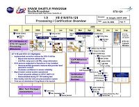
Thanks Joel for a new Topic. Since I am the King of PowerPoint Chartmakers I could take offense at your views - but I agree (mostly). When I added the graphic from your linked story (a really bad example of a PowerPoint chart) I purposely made it small to give readers an example of what it would look like from the back of a conference room.
Readers can double-click the image to get a larger view, but it does not get any better!
My online System Engineering course at U. Maryland uses PowerPoint charts (along with textbook and journal papers) as the main teaching medium, as did my previous courses at Binghamton U. and Brandeis U. as well as my presentations at work.
My charts generally use 24pt font or larger, reliably readable from the back of the room given normal sized screens. I limit the number of bullets to 5..7 and make them short. I usually include a graphic (only one) and I make that large enough to read reliably.
I use the great NOTES feature of PowerPoint to hide the details under each chart. Interested viewers can request a softcopy of my charts and read the notes. The notes are also helpful when I have to give a presentation months after it was fresh in my mind.
Yes, I have seen my share of awful PowerPoint charts, but also some really great ones.
I think the combination of spoken words, key point bullets, and a graphic is far better than words alone or words plus a prof. scratching on the chalkboard. (Can't call 'em "blackboards" anymore, and now they are "whiteboards" you write on with special erasable pens :^)
As for the dictum: Tell 'em what you're gonna tell 'em, tell 'em, tell 'em what you told 'em I agree completely with that strategy as the best way to get a message into the headbones of the most people. What do you favor?
I'm not sure what Socrates, Plato,and Aristotle would have done with PowerPoint. I guess Socrates would have avoided it. Plato would have used it grudgingly, but Aristotle -OH! ARISTOTLE- he would have been (almost) as good as me!
Ira Glickstein
Hi Ira,
I don't think I've seen you use PowerPoint at your presentations at philosophy club. I recall visual aids such as a professors cap and gown when presenting the views of Prof. Pangloss of Candide fame and a soda can to illustrate how a situation is different when viewed from different views, but I don't remember any PP. Be that as it may, I will accept your claim to the throne of PP.
Although I've used slides at professional meetings, I've never used them in a course except perhaps in the first session in order to illustrate that the stuff we're going to spend 14 weeks learning actually has some use. I don't doubt that images and bullets may have a place in education in which indoctrination in a discipline is the goal. I can certainly see the point in remote learning situations. However, in an onsite class with a professor who to some extent flies by the seat of his pants exploring what students find difficult or confusing, the situation demands a chalkboard (yes, a real chalkboard). I think it's a question of individual style and the nature of the course, not right or wrong.
The point of the article on the website I forwarded, had not to do with teaching, but was about reporting to peers. For a fixed set of material for which truth is not an issue, perhaps PP has its place. For "selling" an idea PP is ideal, since it narrows and controls the focus. The danger is when it's used to sell a technical or scientific point of view to peers. The article cited is saying that PP discourages disbelief and doubt just when skepticism is required. With respect, m'Liege -Joel
Thanks joel for remembering my Dr. Pangloss impression and my soda can illustration. The only time I remember using PowerPoint at the Philo Club was when David Dingee and I had a "debate" on funding for space travel and we put together a joint PP slide set. At the time it was tough to arrange for a projector but now it is much easier.
You invocation of Socrates, Plato, and Aristotle, and my reply that Aristotle would glory in PP got me thinking and researching Aristotle. I've spent a couple hours putting together his PP on the "Four Causes" and the "Five Elements". The charts will be featured in a new topic on the Blog and perhaps a Google Knol.
I should not be doing this now because last night was the deadline for my students (U. Maryland online grad course in System Engineering) to submit their Research Papers. I have 30 dry, mostly plain text papers to read, comment on, and grade. A few will be brilliant and enjoyable but I dread the rest.
Of course, I am doing this Blog and Knol work precisely because otherwise I'd be doing those papers! At Binghamton U. where I taught face-to-face, students presented to the whole class using PP and I actually looked forward to it.
As for use of PP for reporting to peers (the subject of the item you linked to) I have mixed emotions. How many of the key execs making the decisions will actually plow through written text reports? You are lucky to get a 15-30 minute slot to pitch to a group of them in person. The best you can hope for is that some will actually read the "Executive Summary" of a few pages at the front of the printed report.
My use of PP, with hard-hitting, short-bullet plus graphics slides and detailed Notes is, I think, "the best of all possible worlds" (to quote Dr. Pangloss :^). My notes are detailed prose just like a report. The slides that are shown at a presentation contain the main points -the "take home" messages- I want the execs to pick up. If anyone is interested in the details they can read the notes under the charts that make the point they want clarified.
I agree with you that most PP charts are not like mine at all. They are all too often an "eye test" jumble of too much text in too small a font, and often in a preset format that stifles and distorts the message. I would rather see a written text report than that type of PP slide set.
I doubt things will change in the direction of text reports in government or industry. Everybody in charge now grew up in the TV generation where problems were always solved in 30 minutes or an hour at the most. They now use the Internet where things are also short and graphic. They are really just a smart as we were (at least some of them) but don't have the inclination or "sitzfleish" to sit down and read a prose report.
Ira Glickstein
Post a Comment